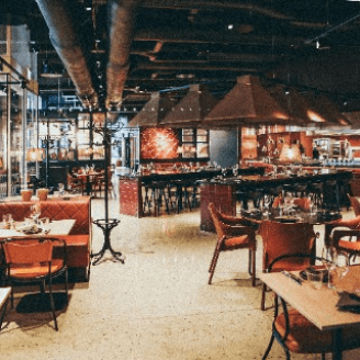
Find your Photographer
Redesign of an e-commerce website to improve navigation, increase conversion rates, and enhance the overall shopping experience. The project aimed to create a more visually appealing and user-friendly platform to drive sales and customer satisfaction.

Ottawa, Ontario, Canada
2006
E-commerce
$1.578 billion (2019)
5,000+
Challenge
The e-commerce site had a high bounce rate and low conversion rates due to poor navigation and a cluttered interface. Users found it difficult to find products, and the checkout process was cumbersome. Our challenge was to streamline the user journey, improve product discoverability, and simplify the checkout process to enhance user experience and increase sales.
Results
The redesigned e-commerce site saw a 40% increase in conversion rates and a 50% reduction in bounce rates. The new intuitive navigation and clean interface improved product discoverability, leading to a 35% increase in average order value. Customer feedback was overwhelmingly positive, with satisfaction ratings rising from 3.8 to 4.7 stars.
35%
Improved onboarding process
25%
Increase in user retention
84%
Increase in time spent on website


Process
Research & Analysis: We conducted user interviews, surveys, and analyzed in-app analytics to understand the pain points and user needs. We also studied competitor apps and industry trends to gather insights
Information Architecture: Based on the research findings, we restructured the app's navigation and content, prioritizing features and information according to user needs.
Wireframing & Prototyping: We designed low-fidelity wireframes to visualize the new layout and navigation, iteratively refining them based on user feedback. Afterward, we built a high-fidelity, interactive prototype to test the design.
Usability Testing: We conducted usability tests with a diverse group of users to validate the design and identify areas for improvement. Based on the feedback, we made necessary adjustments to the design.
Visual Design & Style Guide: We developed a cohesive visual language, including color schemes, typography, and iconography, ensuring consistency throughout the app. We also created a style guide to maintain design consistency in future updates.


“ With our new visual branding and language in place, the new Shopify brand clearly captures the essence of our current and target customer base, our employees, and our values. ”
Tobias Lütke
CEO, Co-founder | Shopify


Conclusion
Revamping the e-commerce website proved to be a game-changer in enhancing user experience and driving sales. By simplifying the navigation and checkout process, we created a more enjoyable shopping experience that significantly boosted conversion rates and customer satisfaction. This project highlights the critical role of UX design in the success of e-commerce platforms.


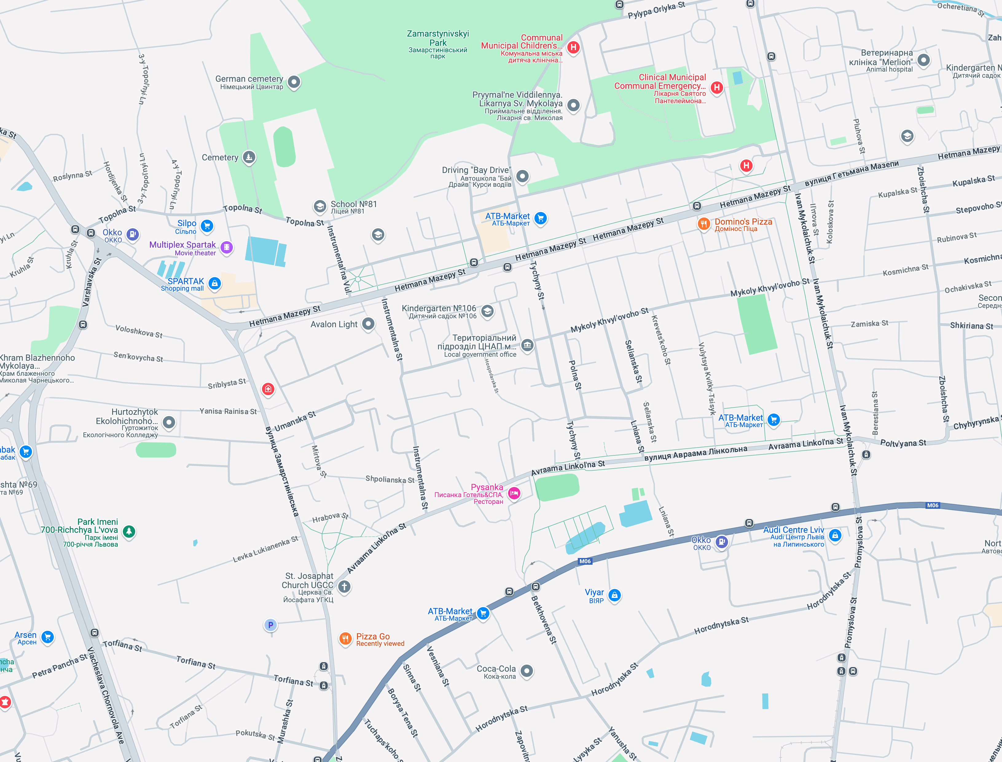
Improving Tourists’ Trust and Engagement on Google Maps
By enhancing walking navigation with Smart Route Suggestions, Safety Indicators, and Local Insights
tailored to travelers’ needs
Summary
We designed a Travel Mode with smart route suggestions, safety insights, a crime rate heatmap,
and emergency access, aimed at improving clarity and traveler confidence.

Smart route suggestion
Total trip: 57 min
Done
9:41
Travel mode is on


Sponsored
Dediko
4.3
(206)
1.2km
Restaurant
Open
Closes 22:00
Ресторан грузинської кухні
business.google.com/
Visit Site
Direction
Menu
Website
Call
Share


Sponsored
[Name]
[1.0-5.0]
(Qnty)
[Distance]
[Type]
Open
Closes [Time]
[Text]
[Link]
Visit Site
Direction
Menu
Website
Call
Share
Explore
You
Your location
Place Name
20 min
32 min
9:41
Travel Mode is ON
15 min
7
min
18
min
15
min
5
min
🚨
Area’s Crime Rate
20
Min
Arrive 7:15 PM
0.7 mi
7 ft .
3 ft .
Mostly used route
Mostly Flat
Low Foot Traffic
Well-Lit Route
10
Reports
15
Min
Arrive 7:15 PM
Steep Incline
Low Foot Traffic
Poorly Lit
10
Reports
32
Min
Arrive 7:15 PM
Hilly
Low Foot Traffic
Poorly Lit
10
Reports
Walk


Sponsored
Dediko
4.3
(206)
1.2km
Restaurant
Open
Closes 22:00
Ресторан грузинської кухні
business.google.com/
Visit Site
Direction
Menu
Website
Call
Share


Sponsored
[Name]
[1.0-5.0]
(Qnty)
[Distance]
[Type]
Open
Closes [Time]
[Text]
[Link]
Visit Site
Direction
Menu
Website
Call
Share
Explore
You
9:41
Travel mode is on
Your location
Place Name
Walk
8 min
32 min
32 min
32 min
High crime rate
Mostly flat
3h
33m
Arrive 5:53PM
.
via Linkol’na St
16 Km
.
.
Start
Add stops
Save
32 min
32 min
🚨
🚨
7
min
18
min
15
min
5
min
🚨
Show Crime Rate
15
Min
Arrive 7:15 PM
0.7 mi
7 ft .
3 ft .
See Reports (10)
Mostly used route
Well lit
22
Min
Arrive 7:15 PM
0.7 mi
7 ft .
3 ft .
See Reports (10)
Medium lightness
10
Min
Arrive 7:15 PM
0.7 mi
7 ft .
3 ft .
See Reports (10)
Low lightness
Walk
3 Crimes reported
More Info
🚨
Context
I collaborated with a team of 2 product designers to improve the tourist experience by creating a more personalized journey for travelers.
Our focus was on Tourist , aiming to boost retention through features like custom travel mode, and safer walking navigation.
My Role
Product Designer
User research and User interface design
Team
2 UX/UI Designers + Mentor
Timeline
May - July 2025
Tools
Figma, FigJam, Meet
Problem to Solve
Tourists often struggle to assess route safety and clarity in unfamiliar areas, leading to confusion, stress, and missed opportunities for confident navigation and exploration.


🧩
Design Consideration: Supporting Less Tech-Savvy and Older Users
We considered the needs of older and less tech-savvy users, whose challenges align with Nila and Nico, especially around clarity, confidence, and ease of use.
Our solutions focus on simple, safe, and stress-free navigation in unfamiliar places.